From Content to Wireframe
A Guide to Wireframing for Beginning Web Design Students
Introduction
It can be a difficult process to develop a wireframe for a client even with finalized content in-hand. This post provides a guide for the process of developing a wireframe from content for a small-sized website, and is intended for beginning Web Design students. I created the writing and logo/brand, for the example used for this guide (2gogreen.me), and I’m hoping to fully develop this project in the near future.
Background
It is the job of the web designer to organize large amounts of information, so that it becomes not only readable, and appealing—but so that it also achieves results. Our goal is for the clients of our clients to act: to click, join, sign up, contribute, subscribe, purchase, or whatever the case may be.
Much like the ‘under painting,’ for the traditional artist, wireframes for the web designer form the foundation for all those later-added details. Navigation and action indicators, item placeholders, and composition cues will later give way to a detailed, and branded design prototype. Wireframes are an important tool in achieving consensus about the areas and functionality of the site before exploring mood boards, brand integration, color, imagery, and the other many details that make for a successful prototype. This also helps to correctly set expectations for the site functionality and scope. The use of the visual language of the wireframe can help to eliminate the confusion that arises when designers and clients inevitably use industry terms that may not be familiar to the other party.
There are many powerful wireframing software packages available. However, given the small-size scope of this example site, and our segwey into prototype design and construction in the next part of this series, we’ll use InDesign for wireframing purposes here.
Process
I. Read, Evaluate & Place Content on the Pasteboard in an InDesign Document.
The start file here was created with InDesign CC 2015 . This is a zipped package with an IDML included (for older versions of InDesign.)
We are working with a Content-First approach, which is why it is so important that we’re using real content, and not lorem ipsum, or other placeholder content.
And at this stage, although it’s tempting to start creating stellar graphics and placing them, or working with the typography, we must read and evaluate the content that we’re designing as a first priority .
II. Familiarity with the Layout Program
At a minimum, if you’re not familiar with InDesign, watch this quick primer:
This is Chapter 1 of David Blatner’s InDesign CC Essential Training on Lynda.com. There is much more to the program than this 30-minute primer can offer (see the 9+ hours of content in the whole of the “Essentials” title for an indicator!) however, this chapter will be a good springboard for further study and will provide what we need to get started with this guide.
III. We Must Start Somewhere: Though, We Should remind ourselves that this is the only time our web design will live in a fixed medium.
After all, under web conditions, we have devices ranging from watch / small smartphone to 4K+ web-enabled televisions & computer screens.
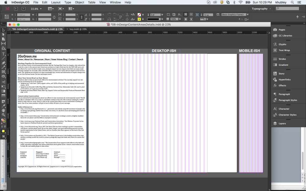
Though I love the ‘Mobile First’ thought technology, for me, beginning a wireframe and then a prototype is an incredibly iterative process, in which, I’m working with more than one size-range right out of the gate. You’ll notice two sizes as a starting point in the file from the link above. Both have a 24-column grid: A.) ‘DESKTOP-ISH’ (This is set at 2000px x 1600px, with large margins making for a content area of 1200px x 1600px;) And B.) ‘MOBILE-ISH’ (320px x 1600px. 320 is a common starting point currently for mobile portrait designs.) For now we’re designing with “Logical Pixels” rather than “Actual Pixels,” (for a chart comparing iPhone “Logical” and “Actual” pixels click here. And there’s some great information on the Mozilla Developer Network here for strategies on handling the pixel conundrum on the coding side.) We’ll address placing and working with graphics for high resolution and retina displays in the upcoming post: From Wireframe to Prototype.
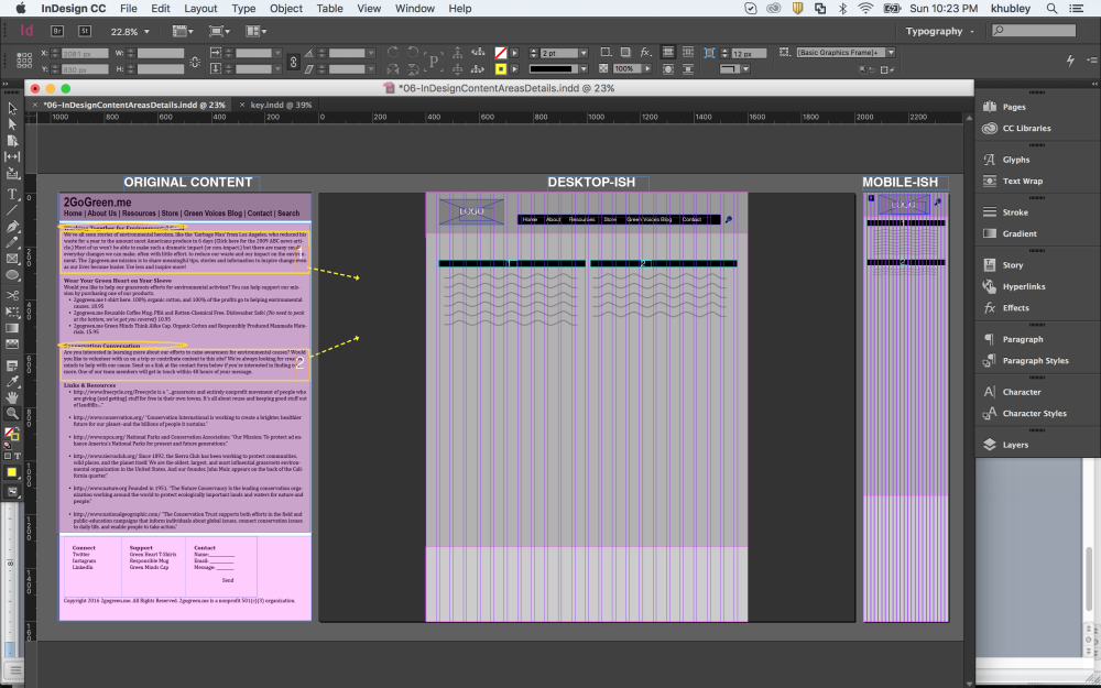
IV. Identify Key Content Blocks and Utilize Descending Gray tints to identify those areas.
Remember, do not use any color or graphics at this time: for those will often work to eclipse foundational decision-making for our projects (pink shown below for highlighting / guideline purposes only.)
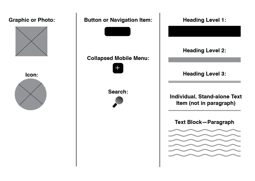
V. Decide on a Clear Visual Language.
Using the button below, you can download the InDesign file (again, IDML included for previous versions of InDesign) and copy and paste those elements as you continue to rough-in the areas of your design in the start file provided.
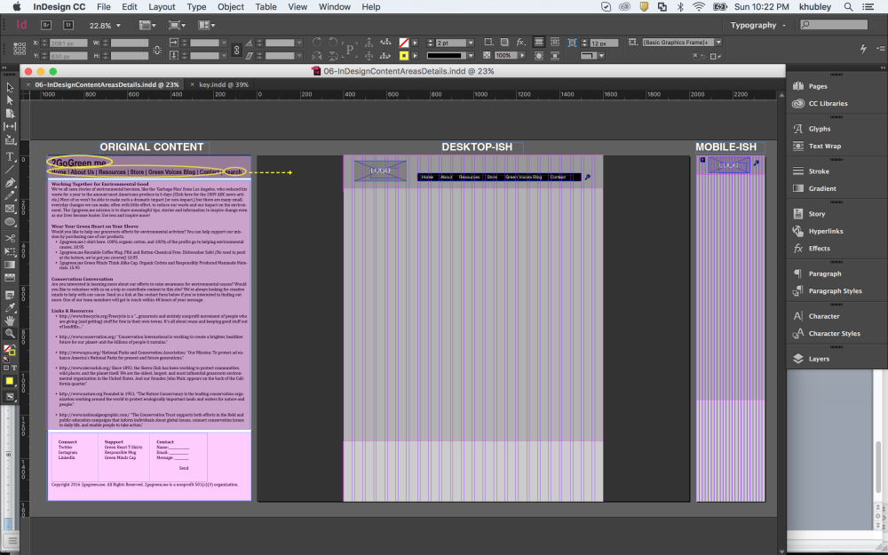
VI. A Top-Down Approach
The logo and Navigation items are the first we’ll place, followed by the other content areas. See the slideshow below to see the stages of development:


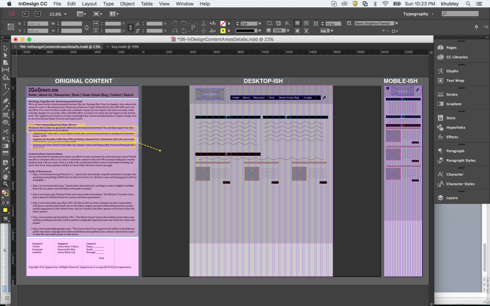

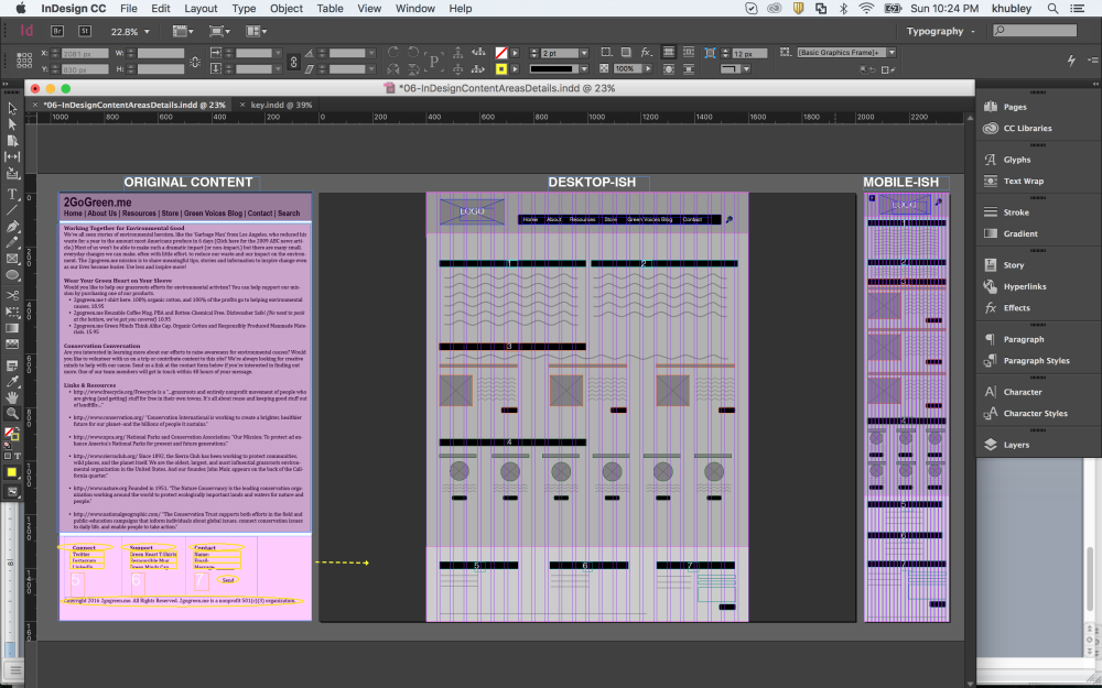
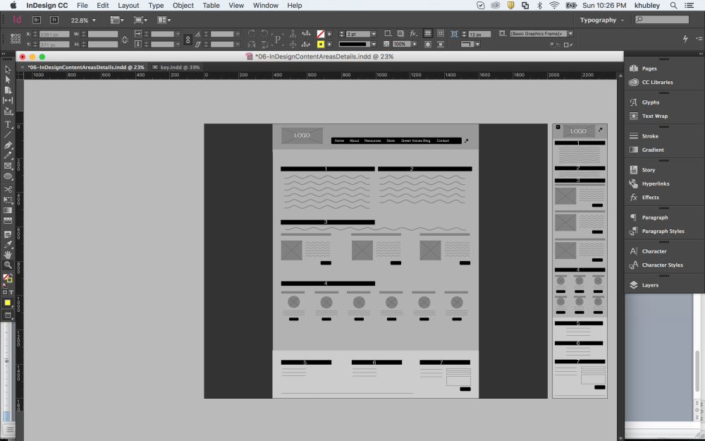
VII. Continue to develop Areas of the Wireframe Using the Above Slideshow as a Guide.
Hint: When you see a bulleted list in the original content, try moving that content into separate columns and pairing with a visual element like an icon or image.

Thank you for stopping by! And don’t forget to come back for next week’s post: From Wireframe to Prototype.